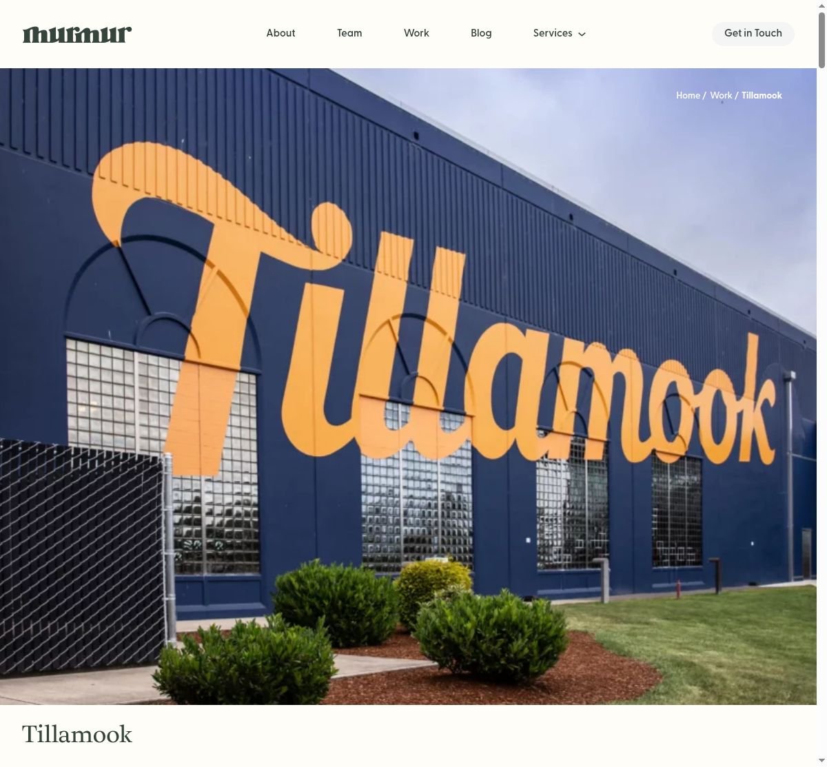
When Tillamook, an iconic Oregon dairy company, needed to extend their highly lauded brand and develop guidelines for a national product rollout, they turned to Murmur Creative. The agency embarked on a transformative journey, redefining Tillamook’s brand identity with a vibrant, confident new look that resonated with the brand’s future vision. This rebranding process included a bold overhaul of their photographic campaigns, transitioning from dark, gritty shots to a new evergreen photography style centered around heroic product shots.
The results were astounding. With a streamlined brand, a product-focused color audit, and a new family of typeface guidelines, Tillamook was set to brighten the national dairy scene. Murmur Creative’s innovative approach to branding, photography, illustration, and packaging design not only revitalized Tillamook’s presence, but also ushered in a new era for the brand.
- Successful branding requires a deep understanding and respect for a company’s history and future vision.
- Photography style plays a crucial role in creating a brand’s visual identity.
- Consistency in branding across all platforms and mediums is key to a successful national rollout.