Catalyze Redesign: Bold Logo & Sustainable Color Palette
Agency
Brand
Platforms
None
Industries
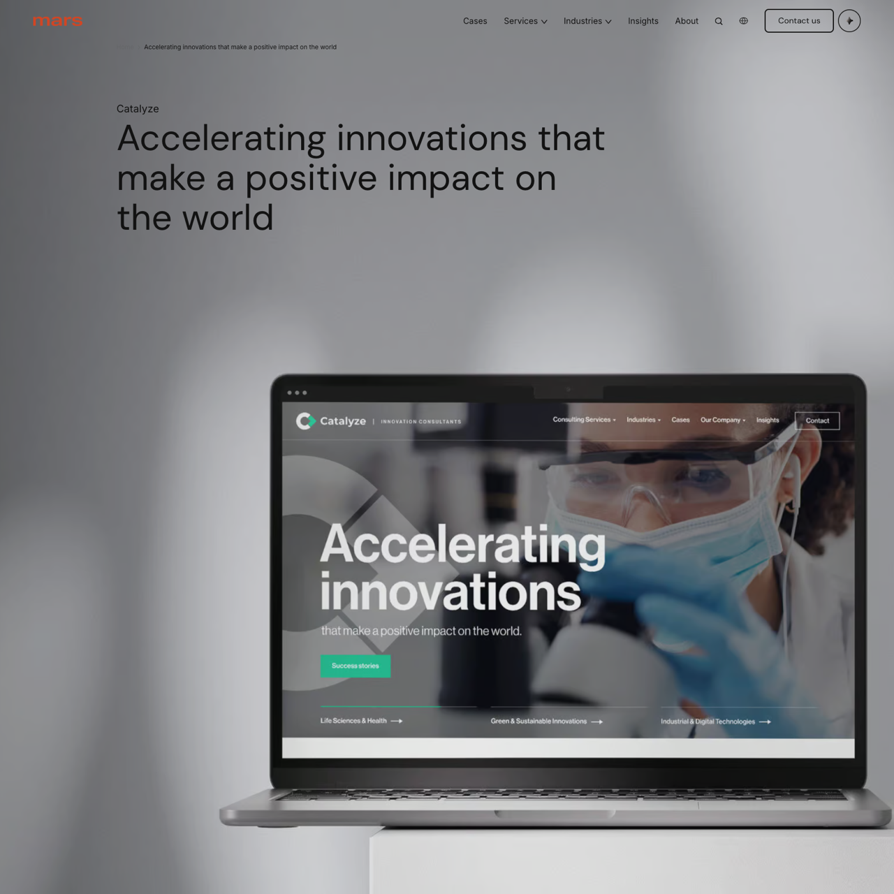
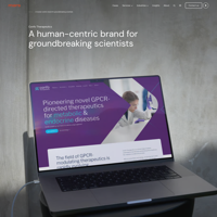
Catalyze redefined their brand identity through a strategic redesign focusing on innovation and sustainability. The new logo, a bold 'C' paired with a forward-pointing arrow, symbolized catalyzation and progress. A fresh blue-green color palette was introduced to reflect trust and environmental responsibility. This rebranding enhanced brand recognition while aligning with the company's commitment to driving impactful change. The project successfully elevated Catalyze's visual presence, reinforcing their mission to foster creativity and sustainability in the digital space.
View the full case on the agency site
Original write-up, full visuals, full context.
Published around:
January 20, 2025
?
Added to Agency Inside:
April 7, 2026