Clearing the Chaos: Schiphol's Iconic Signage Revolution
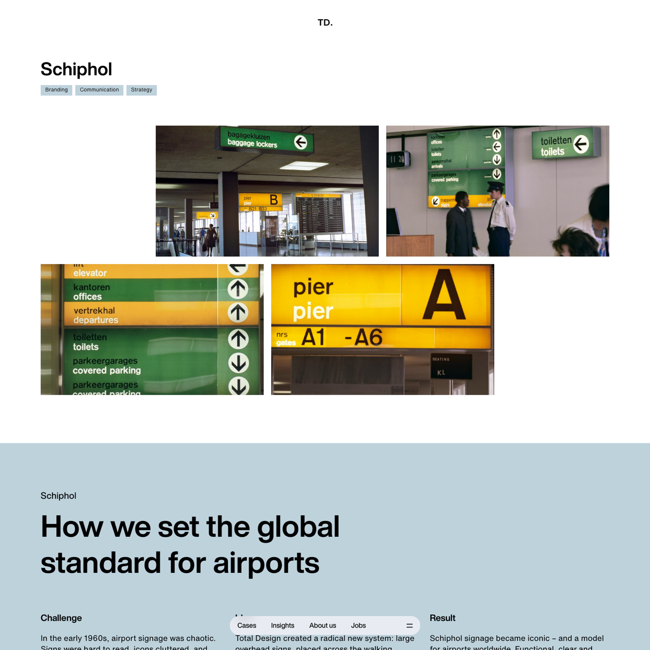
Schiphol's iconic signage revolution began in the 1960s when Total Design introduced a radical system of large overhead signs, using yellow for main routes and green for secondary information. The solution featured clean, functional typography—Akzidenz Grotesk—ensuring readability from a distance. This approach transformed airport navigation, setting a global standard for clarity and simplicity. Decades later, Schiphol updated its signage with pictograms and Frutiger typeface, preserving the core principle of guiding travelers with precision and ease. The result was a timeless, functional design that continues to shape airport navigation today. "Schiphol’s wayfinding by Total Design shows how clarity endures—design as function, not ornament."