Disruption Reimagined: EpilepsieNL's Lavender Purple Identity
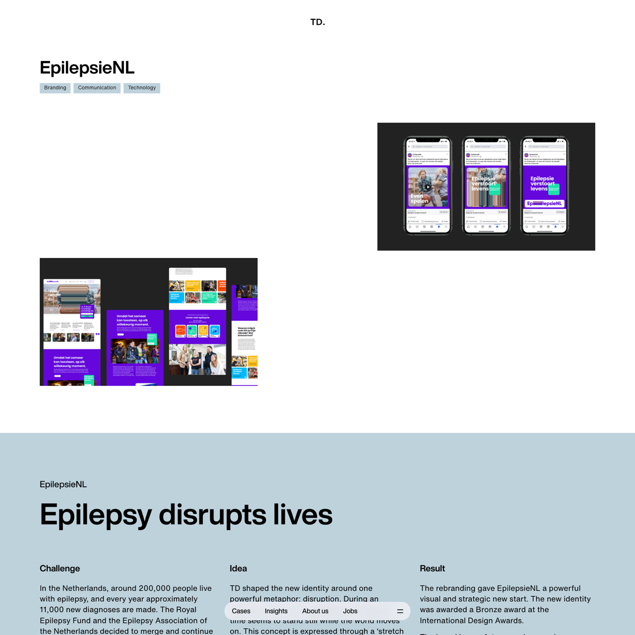
EpilepsieNL rebranded to emphasize the unpredictability of epilepsy through a lavender purple identity, using the disruption metaphor to convey urgency and calmness. The new visual language, including movement and dislocation, aligned with the brand's mission to support research, education, and community. The identity received a Bronze award at the International Design Awards, showcasing its impact and future readiness. The rebranding strengthened visibility, fostered a stronger community, and continued research support, positioning EpilepsieNL as a clear platform for people with epilepsy, their loved ones, and professionals. The campaign effectively engaged patients, healthcare providers, and the public, highlighting the importance of epilepsy awareness and advocacy.