Hartstichting's Warm Public Fund Visual Identity Revamp
Agency
Brand
Platforms
None
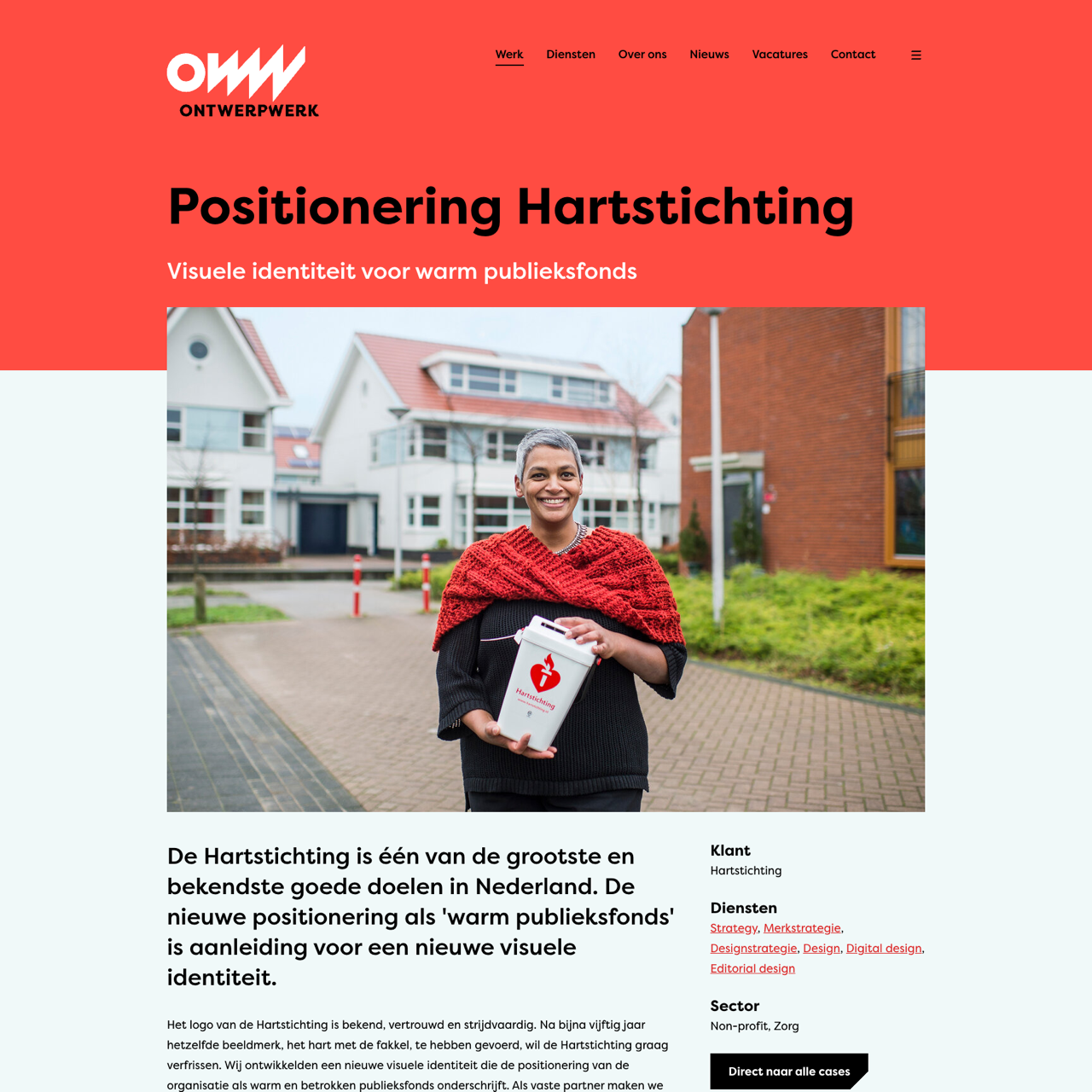
The Hartstichting redefined its visual identity to reflect its role as a warm public fund, creating a new logo with a heart and flame that embodies trust and urgency. The redesign included a concise name, a refined color palette of orange, purple, and brown, and improved typography to enhance readability and recognition. The new identity aligns with the organization's mission to engage a broader audience and inspire impact. In 2014, the organization launched an online annual report that emphasized the urgency, impact, and results of its work, showcasing the new visual identity through personal stories and data. The project demonstrated how a cohesive visual strategy can strengthen brand perception and connect with diverse audiences.
View the full case on the agency site
Original write-up, full visuals, full context.
Published around:
February 11, 2026
?
Added to Agency Inside:
March 22, 2026