Low-Difficulty Communication with Authority: Huurcommissie's Rebranding
Agency
Brand
Unknown
Platforms
None
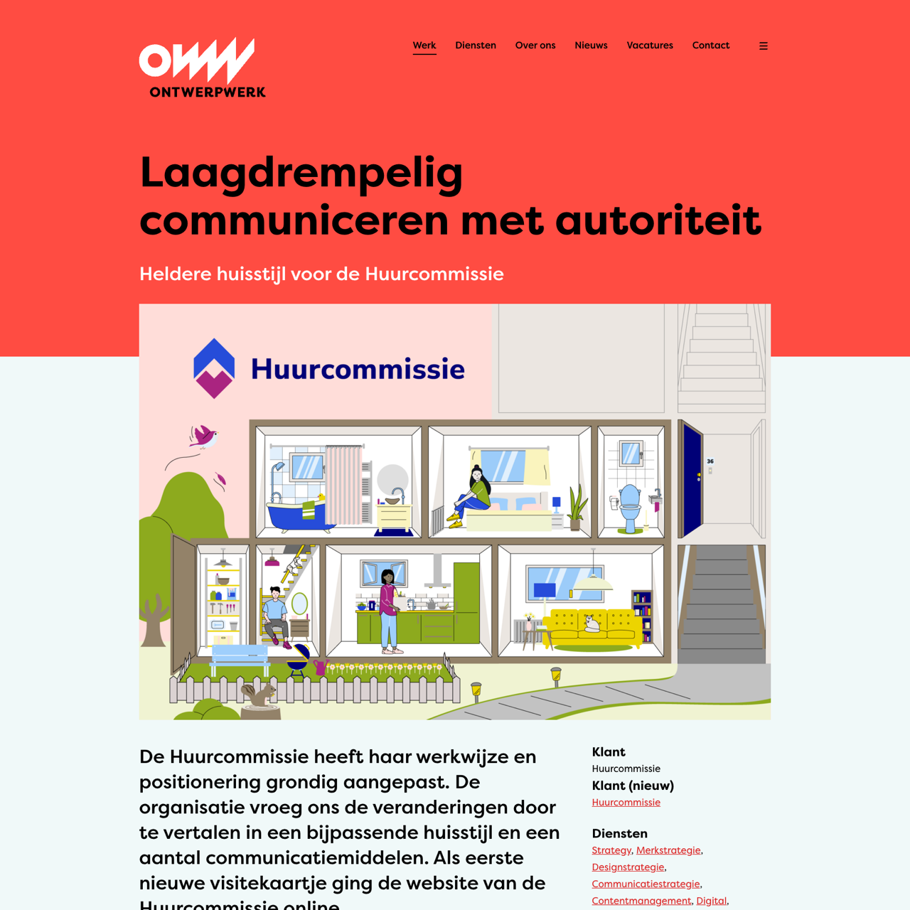
The Huurcommissie rebranded their communication to balance authority and accessibility, creating a new visual identity for their website. The redesign focused on clarity, transparency, and friendliness, aligning with their role as an impartial authority in the social housing sector. The new style features a friendly font, a logo symbolizing tenants and landlords, and a minimalist layout that reflects the organization's values. The project enhanced user experience while maintaining the organization's professional stance. The outcome was a more approachable and effective communication platform for stakeholders.
View the full case on the agency site
Original write-up, full visuals, full context.
Published around:
March 18, 2025
?
Added to Agency Inside:
March 23, 2026