Rivierduinen Logo Redesign: Unified Identity Through Color Palettes
Agency
Brand
Platforms
None
Services
Industries
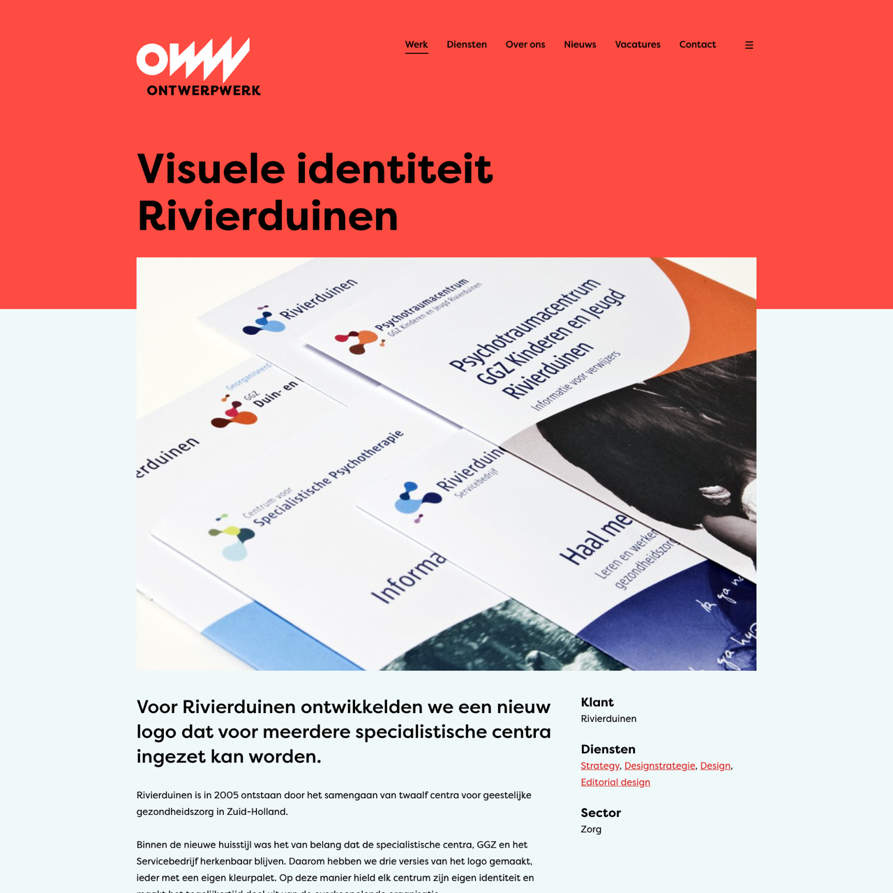
Rivierduinen, established in 2005 as a merger of twelve mental health centers in South Holland, required a logo that preserved each center's distinct identity while maintaining a cohesive organizational presence. The design team created three logo variations with unique color palettes, ensuring each facility retained its individuality while contributing to the broader brand. In 2010, the layout was restructured to introduce automation, resulting in a static logo with two color combinations. The fluid, organic shapes in the logo symbolize the essence of the mental health sector. The redesign successfully balanced innovation with tradition, creating a visually striking and functionally effective identity for the organization.
View the full case on the agency site
Original write-up, full visuals, full context.
Published around:
August 13, 2021
?
Added to Agency Inside:
March 26, 2026