Slimme rebranding voor Pensioenfonds Horeca & Catering: Eenvoudig en toegankelijk
Agency
Platforms
None
Services
Industries
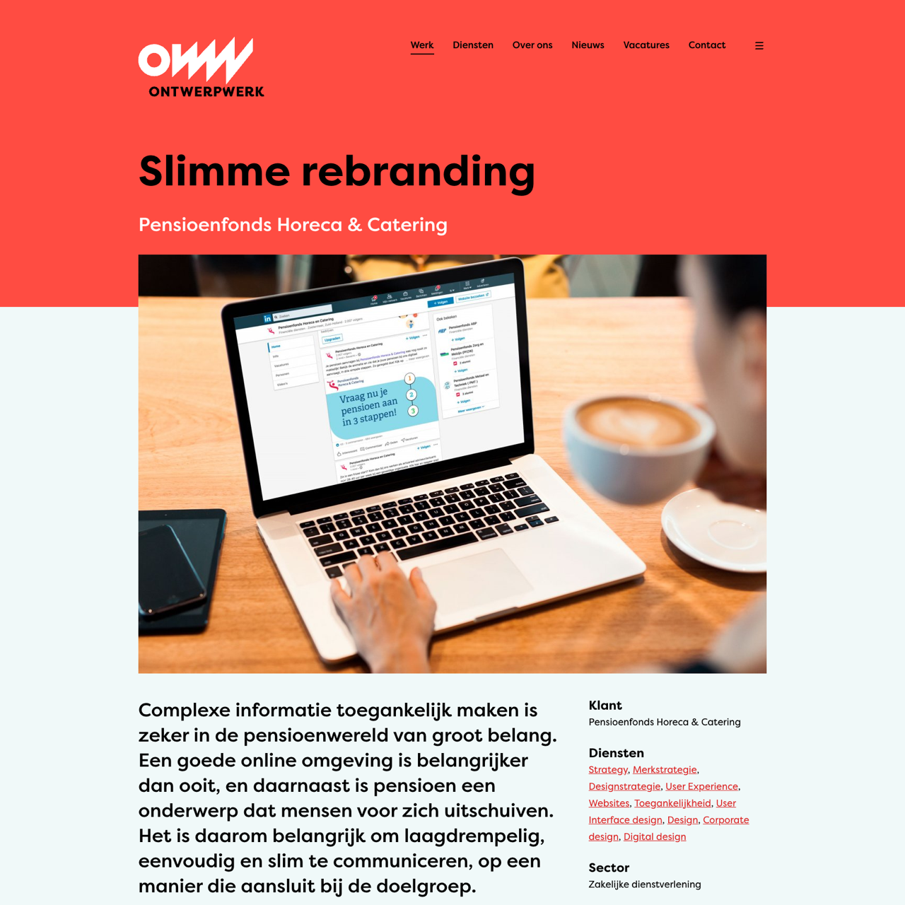
This case study highlights the rebranding of Pensioenfonds Horeca & Catering, focusing on making their online presence more accessible and user-friendly. The project aimed to simplify communication for a diverse audience, emphasizing clarity and inclusivity. Through a design audit, the brand's identity was revitalized with a modern, accessible aesthetic, including a new logo, color palette, and brand guide. The rebranding enhanced the platform's usability, enabling users to better understand life events and their financial implications. The outcome was a more intuitive and engaging online experience, aligning the brand with its mission of clear, simple communication.
View the full case on the agency site
Original write-up, full visuals, full context.
Published around:
July 21, 2021
?
Added to Agency Inside:
March 26, 2026