Staedion Rebrands with 'Samen Thuis' to Enhance Home Experience
Agency
Brand
Platforms
None
Services
Industries
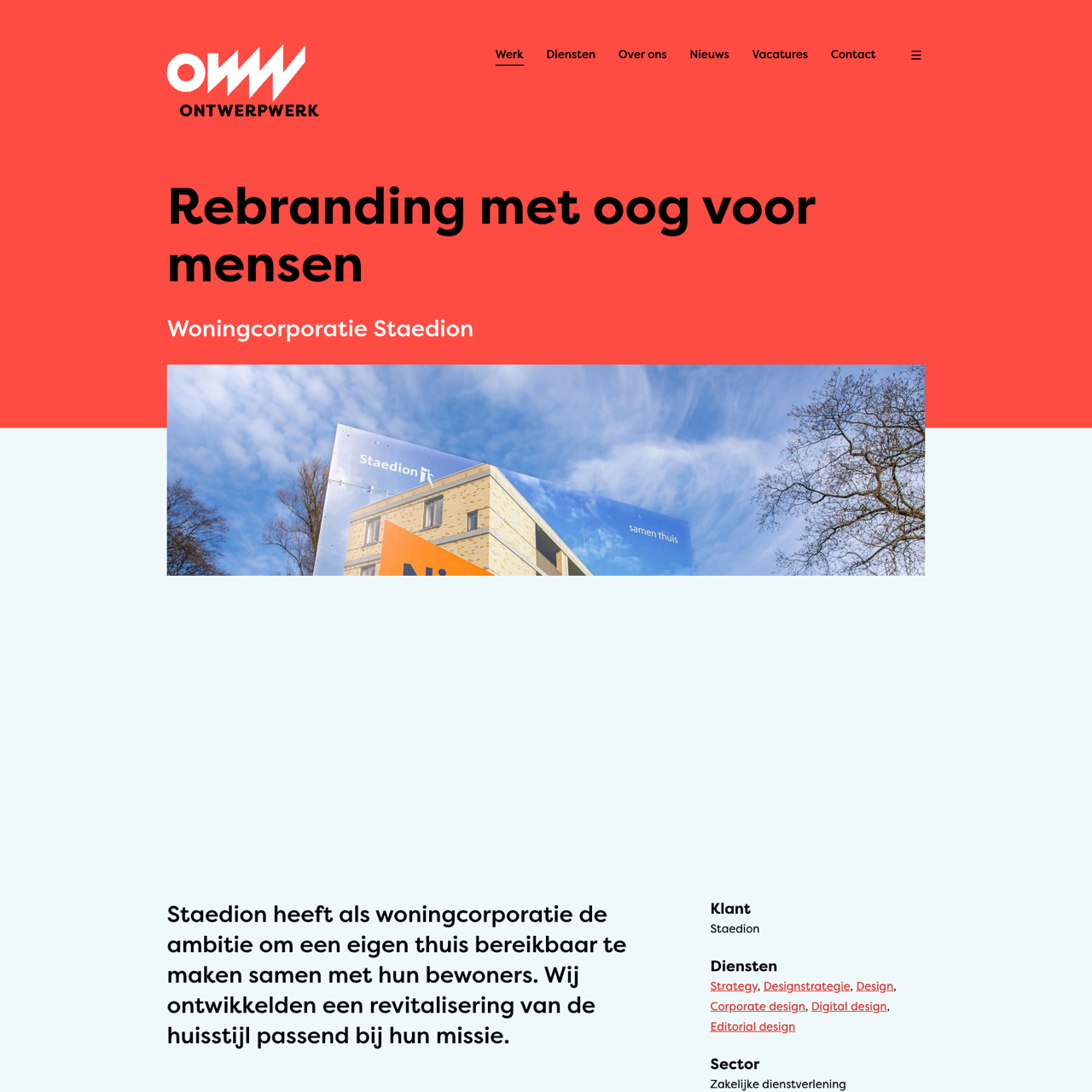
Staedion rebranded their housing brand with 'Samen Thuis' to align with their mission of 'Doe het steeds beter' and 'Maak af waaraan je begint'. The design audit identified key elements like the logo and oranje color that remained unchanged, while introducing a fresh visual identity through a modern palette and typography. The rebranding focused on creating a more recognizable and cohesive brand experience, emphasizing practical solutions and community engagement. The new style enhances the brand's ability to communicate effectively with their target audience, reinforcing their commitment to improving living spaces. The result is a more dynamic and approachable visual identity that reflects the brand's core values and strategic goals.
View the full case on the agency site
Original write-up, full visuals, full context.
Published around:
July 21, 2021
?
Added to Agency Inside:
March 26, 2026