Amstelring: Simplifying Complex Care with Intuitive Design
Agency
Brand
Platforms
None
Industries
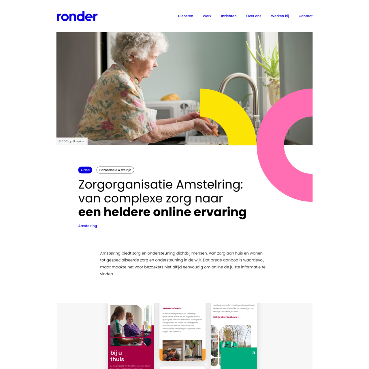
Amstelring transformed its website to make complex care more accessible by conducting user research and empathy mapping. The new structure features three clear entrances: 'At Home' for residential care, 'In Your Area' for community centers, and 'Wonen & Locaties' for residential facilities. This approach simplifies navigation for users seeking personalized support, aligning with Amstelring's brand identity of warmth and organic design. The redesign prioritized accessibility, ensuring users with diverse needs could easily find the right services. The outcome was a more intuitive platform that reflects the brand's values while enhancing user experience.
View the full case on the agency site
Original write-up, full visuals, full context.
Added to Agency Inside:
September 6, 2026