Hello vs. Speed: A Logo Redefined
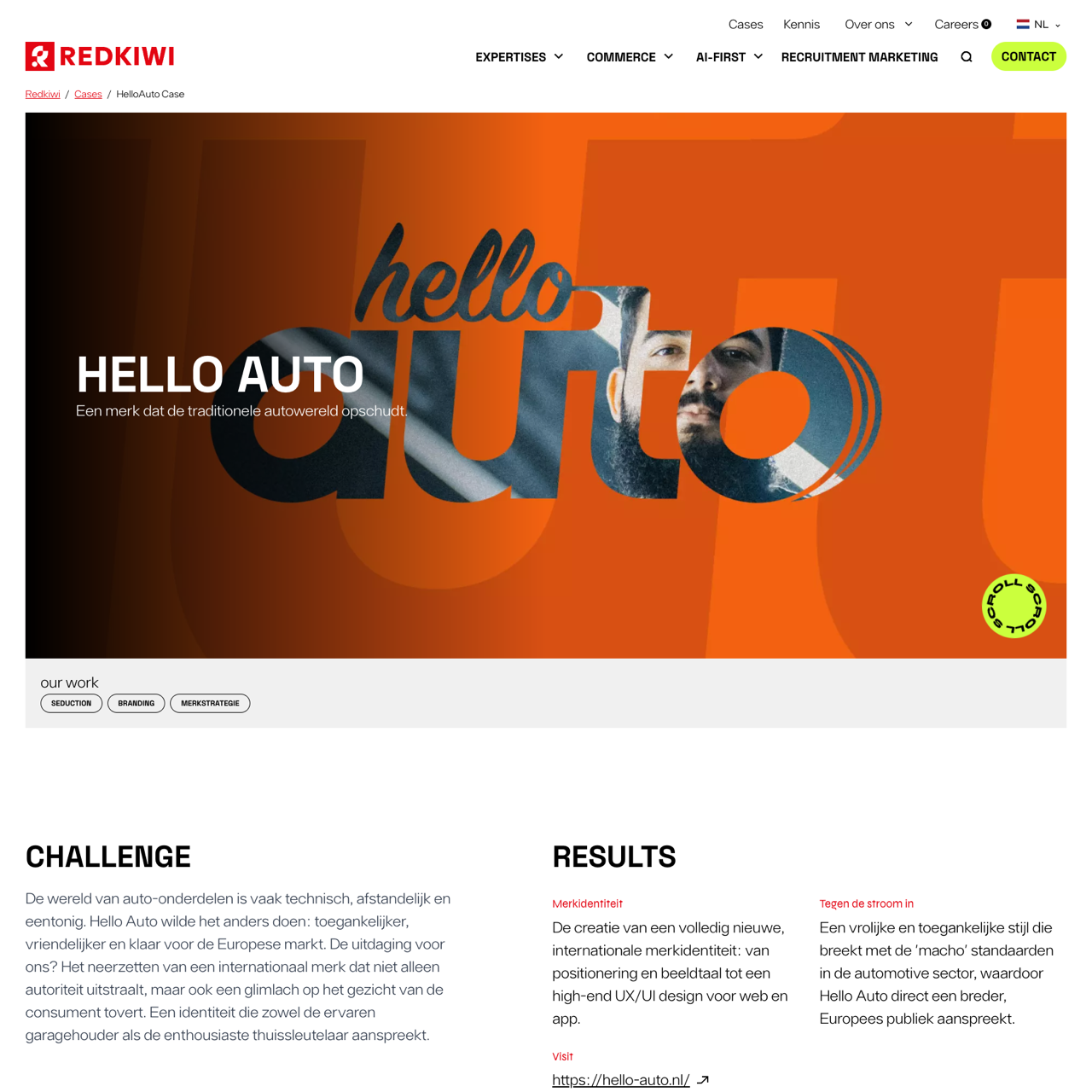
This case study explores how Redkiwi redefined the brand identity by creating a logo that merges speed and playfulness with a human touch. The 'O' is subtly shaped like an autoband, linking the core business while maintaining a friendly and inviting atmosphere. The logo is 'smashable' and remains recognizable and powerful in the smallest app icons. The result is a fresh, dynamic visual that aligns with the brand's mission and values.
View the full case on the agency site
Original write-up, full visuals, full context.
Added to Agency Inside:
April 24, 2026