New Design for Kiesraad: Process-Oriented Identity
Agency
Brand
Platforms
None
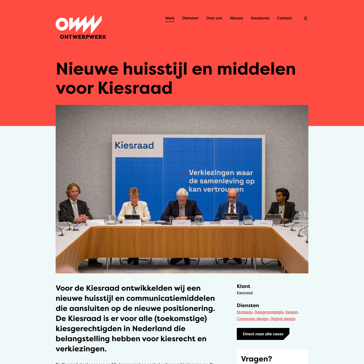
Kiesraad needed a new visual identity to align with their positioning as an independent authority for fair and transparent elections. Ontwerpwerk redesigned their brand with a process-focused approach, emphasizing the voting process and the Kiesraad itself. The logo features a stylized stempotloodje, a red accent, and a clean typography. The new design reflects the Kiesraad's commitment to transparency and accountability. The result was a cohesive visual identity that strengthens their role as a trusted source of information and a reliable voting system. The redesign also highlights the Kiesraad's dedication to fairness and integrity in the electoral process.
View the full case on the agency site
Original write-up, full visuals, full context.
Published around:
November 6, 2025
?
Added to Agency Inside:
March 22, 2026