Rebranding NVB: A New Style with Confidence
Agency
Brand
Platforms
None
Industries
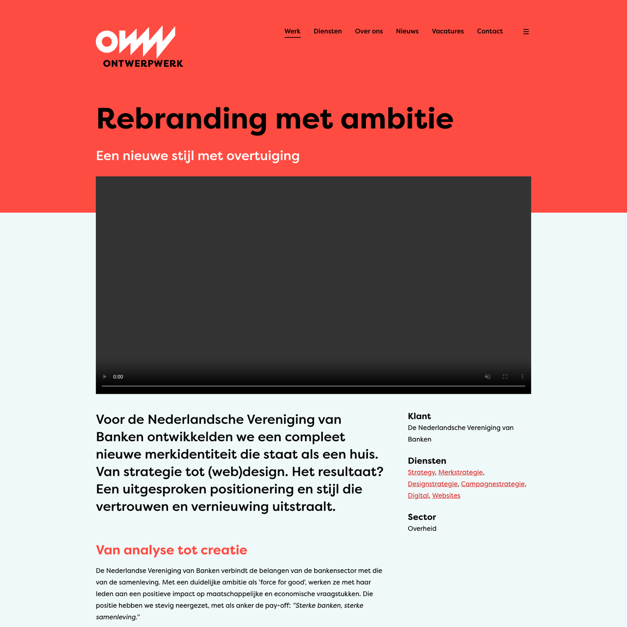
NVB rebranded with a strategic identity that positions them as a force for good, blending strategy with design. The new visual identity, rooted in a design audit and brand guide, establishes a cohesive and impactful presence. This rebranding not only strengthens their market position but also differentiates them from competitors, emphasizing openness, trust, and innovation. The logo, a dual Ds forming the B of Banken, symbolizes the unity of Dutch banking. The new identity ensures consistent messaging across all platforms, reinforcing NVB's commitment to societal and economic impact.
View the full case on the agency site
Original write-up, full visuals, full context.
Published around:
August 12, 2025
?
Added to Agency Inside:
March 22, 2026